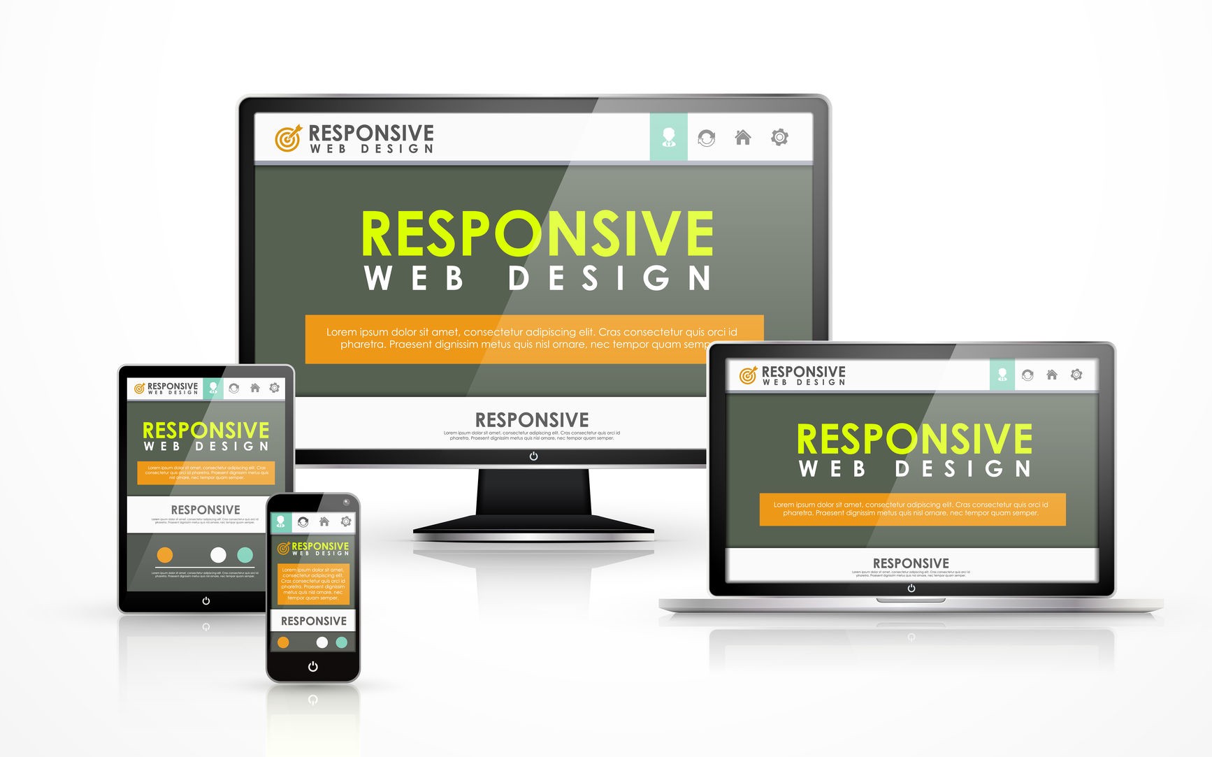
It is common knowledge today that Mobile browsing has outpaced desktop-based access and this gap is only expected to widen even further in the coming years. Responsive Web Design is an approach to web development that aims to make web pages render properly on a variety of devices and window or screen sizes from minimum to maximum to ensure usability and user satisfaction. Generally, design in fields such as architecture or structural engineering employs a more permanent or fixed set of dimensions defined at the foundation level which set the limits and dictates boundaries. However, web design is an entirely distinct discipline characterized by its transience with sizes often flexible, refined, or replaced after a period of time. This is largely due to Inconsistent window widths, screen resolutions, user preferences, and users’ installed fonts which are few of the intangibles that web developers negotiate when a web page is published. But it is worth noting that no design, fixed or fluid, scales seamlessly beyond the context for which it was originally intended.
The fact that a website looks great on desktop screens does not guaranty that it will render equally well when it is viewed on a smartphone or a tablet. Once a design is made responsive, the website will look good (and readable) on all screens. With Responsive Design, web developers are able to create one design with the ability to automatically adapt itself based on the screen size of the device it is being viewed with.
Fluid grids, flexible images, and media queries are the three technical ingredients for responsive web design, but it also requires a different way of thinking. Rather than quarantining content into disparate, device-specific experiences, we can use media queries to progressively enhance our work within different viewing contexts. That’s not to say there isn’t a business case for separate sites geared toward specific devices; for example, if the user goals for your mobile site are more limited in scope than its desktop equivalent, then serving different content to each might be the best approach. But that kind of design thinking doesn’t need to be our default. Now more than ever, we’re designing work meant to be viewed along a gradient of different experiences. Responsive Web Design offers us a way forward, finally allowing us to “design for one and all”
Some of the recommended breakpoints incorporated in CSS media queries to achieve responsive design are set for the following viewport widths:
- 320 Pixels (iPhone landscape).
- 480 Pixels (iPhone portrait).
- 600 Pixels (Android Tablets).
- 768 Pixels (iPad + ~Galaxy Tabs).
- 1024 Pixels (iPad landscape and desktops).
Some advantages of taking a Responsive approach to Web Design include:
- It saves time and money as developers do not have to maintain separate websites for desktops and mobile devices.
- Responsive Designs are easier to maintain as they do not involve any server-side components. You just have to modify the underlying CSS of a page to change its appearance on a particular device.
- Responsive Design is good for a website’s SEO (search rankings) as every page on the site will have a single URL and thus Google juice is preserved. You don’t have to worry about situations where some sites link to your mobile site while others link to your desktop site.
- Thanks to Responsive designs, Google Analytics reports are able to paint a better picture of a website’s usage since the data from mobile and desktop users will be consolidated. The same will be true for the social sharing stats such as Facebook and Twitter likes since the mobile and desktop versions of web pages will have the same URL.
Some of the downsides associated with Responsive web design are a direct consequence of the extra kilobytes it adds to overall page weight because web pages will have to download more CSS stylesheets and Javascript files in order to achieve full functionality.
To conclude, the ability to create Responsive Designs with dynamic and adaptive features that render well on all devices is a key prerequisite in modern web development and a mobile-first approach to design is the best way to achieve this.

